Bloomberg, Factset and the LSEG’s Workspace provide crucial data to stock and bond traders on Wall Street
But those firms are just the tip of the data iceberg in terms of the complex ecosystem feeding financial markets.
For data nerds who want a broader and deeper understanding of that world I recommend the latest Substack by The Terminalist. Here is a link to the piece.
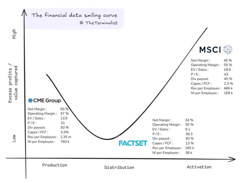
The post argues you can break down the architecture of financial data into Production, Distribution and Activation.
The writer argues the economics of the three broadly mimic the famous Smile Curve, with the greatest value accruing at the beginning and end.
If you don’t know, the Smile Curve helped explain the computer industry and how the two ends, software and marketing, captured more value than the middle, construction.
The Terminalist uses three companies to tell the story. The CME (exchange prices which serve as production), FactSet (data collection and distribution) and MSCI (index creation which provides insights and activation).
The main reason for the SMILE is that like software, the data exchanges like the CME and the index business run by MSCI can scale without adding as many people as Factset’s data collection and scrubbing operation.
The Terminalist included this amazing fact: “CME makes 20x profit per employee than FactSet. MSCI has margins that rival Mastercard.” The writer says CME generates $1.35 million per employee, while FactSet generates $165,000 and MSCI $466,000.
I can attest that three decades ago it wasn’t obvious to everyone how extraordinarily profitable it was going to be to own data from the exchanges and structure it into indexes.
The Substack article weighs in at 7,300 words and is the second by Terminalist, an anonymous blogger. Two months ago, the writer posted a Homeric length opus dissecting Bloomberg.
