The Coronavirus is a huge news story. But how big? How does it compare with other recent events?
It’s an interesting question in part because it helps us understand the magnitude of what we are facing.
It also illustrates both the limits and opportunities for news analytics. We can tap new data sets to gauge the scope, sentiment and momentum of events.
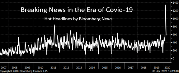
To try and answer the question I looked at a time series of the number of “hot” headlines sent each week by Bloomberg editors over the past 13 years. These tend to be limited to major, globally significant financial events.
The chart shows editors are sending out three times as many headlines during the covid-19 crisis as during normal periods.
That could reflect the importance and global nature of the virus. Or it could reflect editorial bias that is inflating the numbers. One limitation is the historical length of the data.
Only time will tell how history remembers this pandemic. At the moment, however, the data underscores the incredible intensity of the media coverage.
