The best New York Times story this week didn’t appear in the paper.
In fact it wasn’t an article at all, but a web site created by a freelance journalist named Ted Alcorn.
Alcorn tapped into the paper’s public API to create a dashboard that provides some extraordinary insights.
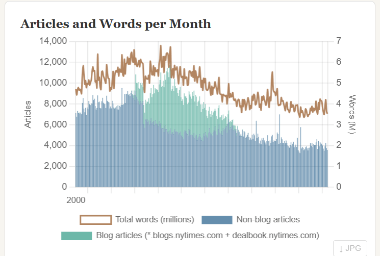
The first was that over the last 25 years, the Times employed – at various times – a total of 26,000 reporters who wrote 1.5 billion words in produce 2.2 million articles.
The real gold comes in the dashboard comes in drilling down to see which beats, topics and people have been covered the most and how that coverage has fluctuated.
A few examples of the kinds of things Alcorn cited that he noticed:
- Trump dominates headlines compared with everyone, including other presidents
- Reporter Maggie Haberman has accrued the most bylines
- India has been undercovered on a per-capita basis
- China coverage peaked around 2014
- Iowa surges every four years
Partisan readers will mine the site for ammunition to argue the paper of record is pro THIS or anti THAT.
But that debate misses larger truths unearthed by the sheer number of stories.
That’s because the number of stories provides a measure of attention largely independent of ideology. Whether a news story about Trump is positive or negative doesn’t change the fact it is about Trump. And the fact that a story was published about Trump reflects the interest in hm.
It’s not a perfect system, but at this scale, breath and consistency, there is probably no better public dataset to measure what is on the minds of Americans.
What Alcorn built – whether he realized it or not – was effectively a better version of Google Trends.
Google Trends provides comparisons based on search volume but it’s normalized so you get relative percentages, but not actual counts. And that limites how well you can compare something that happened in 2009 with something in 2022.
The Times archive comes from a single institution with a mostly consistent editorial policy over 25 years.
That makes comparisons possible. It’s a clean cohort in a world where good data is hard to find.
It provides a useful signal for understanding how attention has shifted among countries, companies, or individuals.
Every communications strategist, researcher, and editor who needs to track the arc of a topic, a name, or an institution now has a tool that didn’t exist a month ago.
Times reporters jumped on the site quickly, mostly they seemed interesed in determing how many words they wrote and where they ranked on the leader board.
Times editors will likely use the tool to better understand how coverage has shifted.
Given its utility, it’s sort of insane that it took an outsider to built it.
But in an open API world, the best analytics often are built by people outside the wall.
The archives of the Washington Post, Financial Times, and Wall Street Journal have the same potential.
Alcorn explained the difficulty of reconciling data: Categories shift and reporters change names. The same subject gets coded differently in different eras.
There are a lot of invisible decisions that go into building a simple dataset.
Alcorn told the Washington Free Beacon he built the project “on public data” with no access to internal systems, and entirely as a personal project.
He got feedback from some Times reporters who flagged bugs and suggested features.
But so far the paper hasn’t commented on the project, which he cheekily called Below the Fold.
