The adage says: no news is good news.
We really mean: No Change in News Flow is Good News.
Of course that doesn’t flow off the tongue as smoothly, but one of the cool things about Bloomberg is you can chart it.
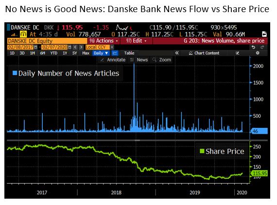
The chart on Danske Bank shows how a money laundering scandal caused a surge in news stories. More importantly, coverage remained elevated for an extended period. The green line shows a steady slide in share price.
You see similar chart patterns for several other companies that burst into the news and remained there e.g. Nissan (Carlos Ghosn) and Boeing (737 Max.)
This isn’t normal. It’s rare to see a massive spike in news flow that is maintained for any length of time. I cannot think of an occasion when a sustained increase was “good news.”
Usually when news — even big news — about a company breaks (think anything about Elon Musk) the increase remains a relatively short-term phenomenon.
Microsoft is the best example of a “nothing-to-see-here” company. It’s among the top five most-covered companies in the world, but with low volatility and no extended spikes.
We built these tools because we think its a great way to measure engagement. DM me if you have a Bloomberg and want to learn more about how they work.
