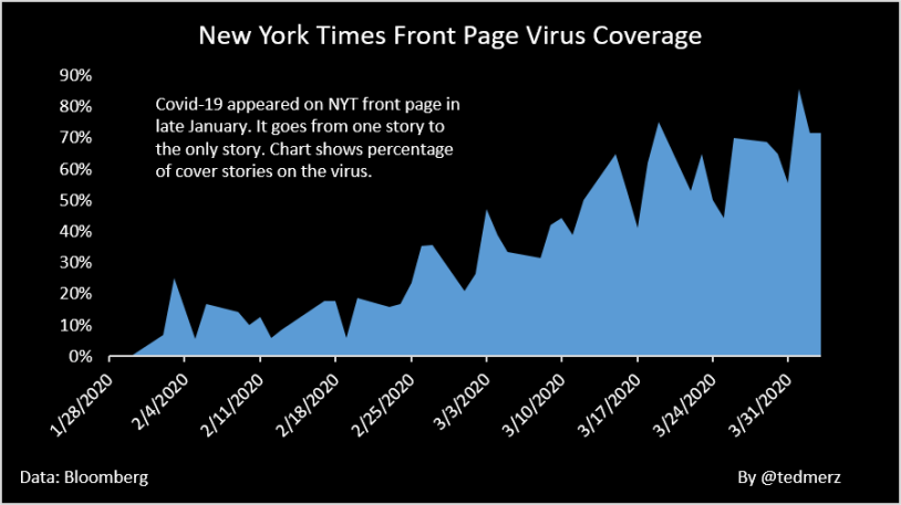
Covid-19 has gone from one story in the paper in late January to the only story.
My chart today shows the percentage of front page articles in the New York Times dedicated to the coronavirus.
Hat tip to Josh Begley, a data artist and filmmaker, who posted an amazing time lapse on Instagram that illustrates the point showing a picture of each article.


I just read a really interesting opinion by Scott Adams & Matt Tabbi said the same thing. News orgs can now measure the clicks, so the generate the stories that are the most profitable.
LikeLike