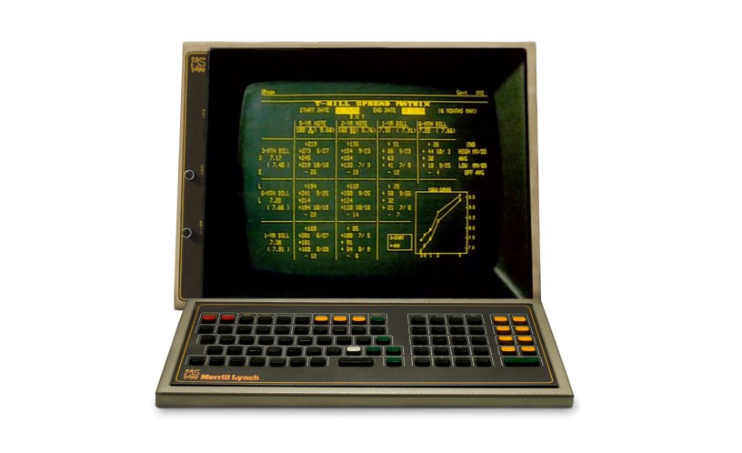
One of the most distinctive aspects of the Bloomberg terminal is the amber-on-black screen display. It started that way for the simple reason that color monitors were rare in the 1980s. Most computer screens were orange or green on black.
Over the years Bloomberg has been criticized for sticking with “old fashioned” colors.
I recently came across a gem of an article from UX Magazine in 2010 that decries the design.
“The Bloomberg Terminal interface looks terrible, but it allows traders and other users to pretend you need to be experienced and knowledgeable to use it.”
I found it hard not to laugh. The whole article is worth reading here:
https://lnkd.in/eDpwsR5
My favorite quotes:
“Bloomberg’s terminal interface will not evolve any time soon … because users will not be satisfied with something simpler and more efficient.”
Bloomberg clients “favor complexity and clutter over efficiency and clarity to sustain a fictive status symbol.”
Mike Bloomberg has argued the amber text on black background has given the company a distinctive look and brand. You could walk onto a trading floor anywhere in the world and spot Bloomberg terminals across the room.
One irony is that since that UX Magazine article was written a number of competitors have adopted similar black screens. The design has evolved into something of a standard for financial platforms.
